
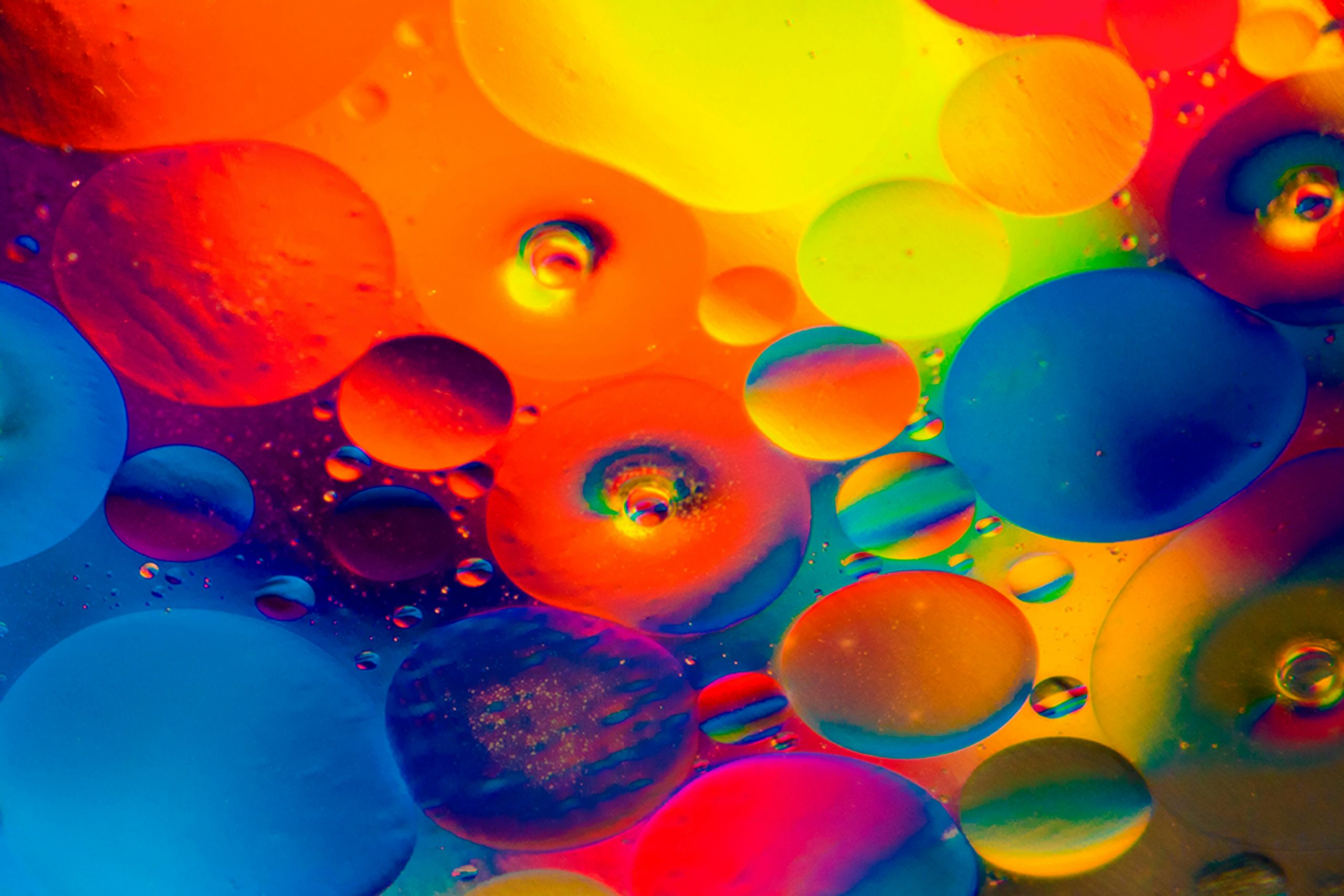
Ever entered a room and felt the colors just didn’t fit right? Color is not just color when it comes to interior design.
Color psychology is a concept that interior designers can utilize to create spaces that enhance functionality, evoke desired feelings, and foster a sense of well-being.
We will dive into the basics of color psychology and how we can strategically use colors to improve our interiors in this blog.
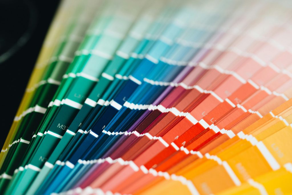
1. What is Color Psychology?
Color psychology is the study of how colors affect human behavior, emotions and feelings. It has many layers and is largely influenced by culture, personal memories, and context.
Despite these, there are certain tendencies that we can rely on when designing interiors. Different colors like red, green, purple, blue, etc., all have their own meaning and application.
For instance, red can evoke feelings of energy and passion, while green can give a sense of balance and trust.
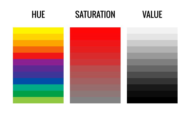
2. The Three Levers of Color
Before we step into the world of colors, color palettes, and color combinations, let us first understand the three levers that control how a color feels.
Hue – This is the base color or the color family. Red, blue, and green are all hues.
Value – Value is the brightness of the color or hue. Higher value means brighter colors, whereas a lower value means darker colors.
Saturation – This defines the intensity of the color. How vivid or muted a color would be.
3. Understanding Color Temperature
Temperature is the perceived warmth or coolness of a color or light. We usually use warm, cool and neutral colors. Let us see its impact on human psychology.
Warm Colors
Red, green, and yellow are warm colors. These hues give a sense of warmth when applied to interior spaces. Warm colors can be used to create inviting and energetic environments. These colors have an expansive effect, which can make rooms look smaller.
Cool Colors
Blues, purples, and certain greens are considered to be cool colors. These colors are linked to calmness, serenity, and relaxation, and are often used in spaces of relaxation to create a tranquil atmosphere. Cool colors generally have a receding effect, meaning they can make a room look larger.
Neutral Colors
These colors are often used to create calm, grounded, and balanced atmospheres. White, grey and beige are the best examples of neutral colors. Often used as backdrops in modern designs, neutral colors are often used to add a touch of sophistication and elegance. However, too many neutrals can cause feelings of sadness and monotony.
4. Effect of Shade and Color Intensity on Atmosphere
Hue is definitely one of the factors influencing mood, but we cannot forget the two other levers. The shade and intensity are also huge contributing factors in defining the atmosphere of interiors. Let us discuss in detail how exactly we can achieve that.
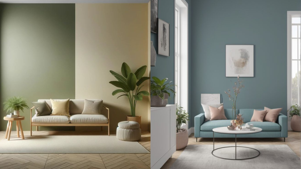
Intensity (Bright Vs Muted Tones)
Bright colors are usually used to inject energy and grab attention. Colors like fire-red engine or lemon yellow are great examples. Used in spaces of socialisation and activity, these colors are a great way to elevate the mood of a space. These colors should be used in moderation, as overuse can cause overwhelm
Muted tones, on the other hand, are softer, more calming, and versatile. Unlike brighter colors, muted colors like dusty rose or sage green can be used on large surfaces as they don’t fatigue the eye as quickly.
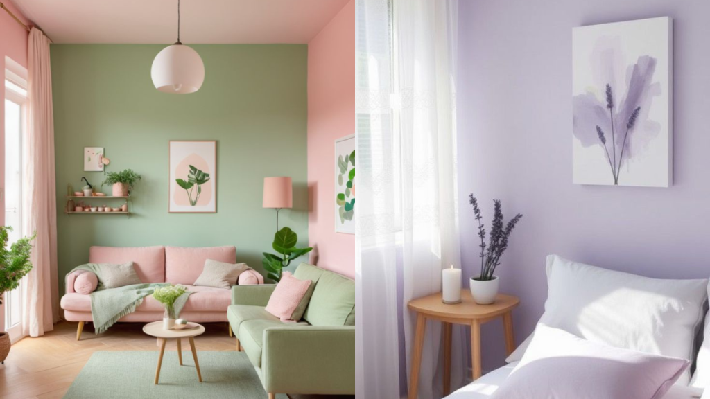
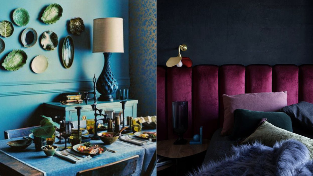
Intensity (Pastels Vs Jewel Tones)
Pastels are generally airy and gentle yet uplifting. Colors like powder blue and lavender are perfect choices for small rooms or spaces to feel fresh and open.
Jewel tones or more intense colors like emerald green or ruby red are rich and dramatic, adding depth and a sense of luxury. Best for accents, these colors make a room feel heavier and moody when not used in moderation.
5. Room-by-Room Playbook
Now that we understand the basics of color and its effects on mood, it’s time we take a look at how we can implement this knowledge when designing some of the most common spaces.
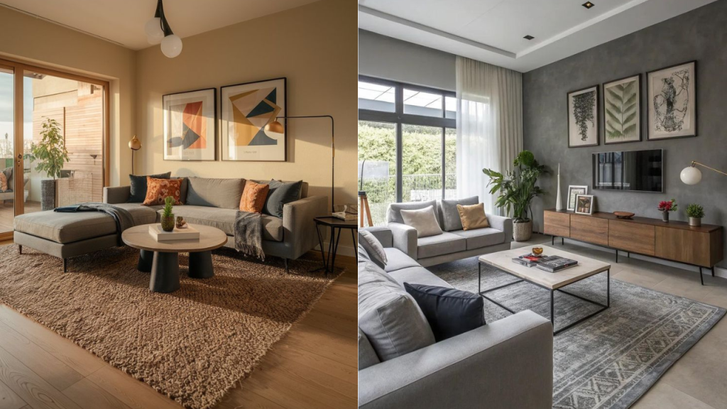
Living Room
Our living rooms often serve multiple purposes, from hosting guests to chilling with our family together on the weekends. The wall color combinations should be such that they cater to all our living room needs.
Color combinations like earthy terracotta or muted yellows paired with accents of blue or green can create spaces that bring forth a feeling of connection and welcome.
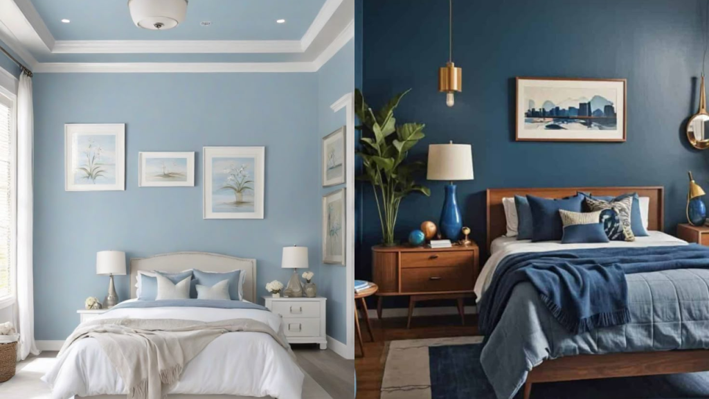
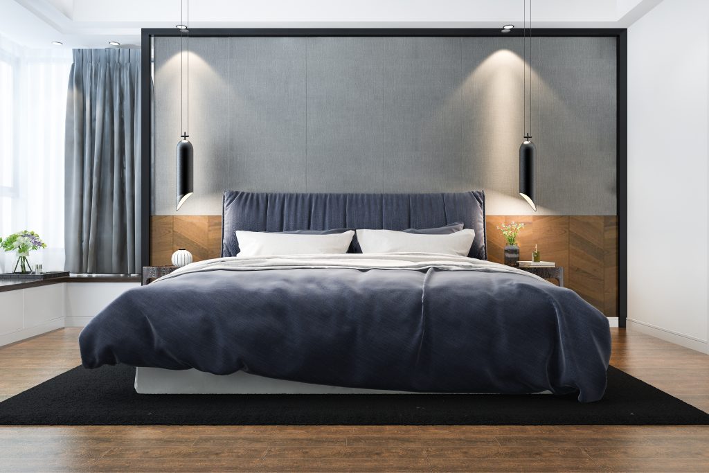
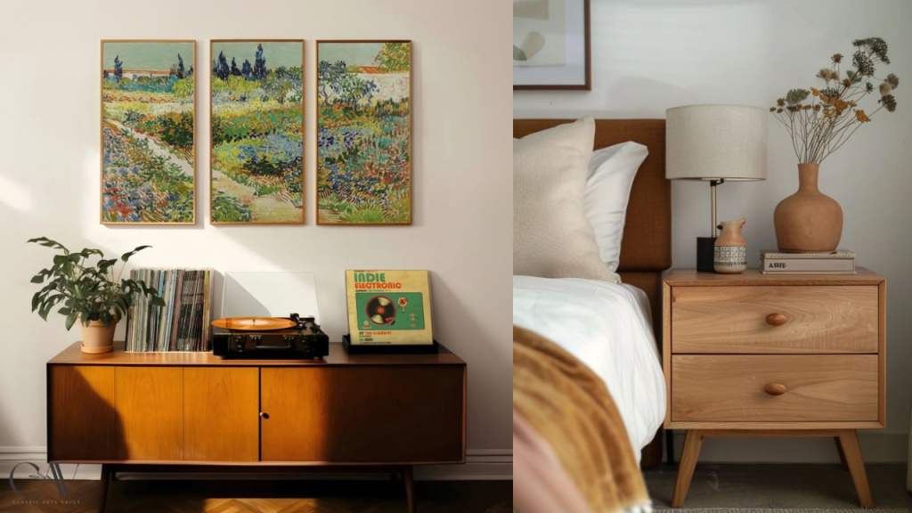
Bedroom
Moving on to the bedroom, we have a space that is meant to be calm, relaxing, and restful. Bright colors are best avoided in this space. After all, we don’t want too much energy in this space.
Cool muted tones like lavender, sage green, or even soft neutrals are best for bedroom colours as they encourage relaxation and better sleep.
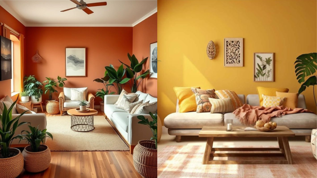
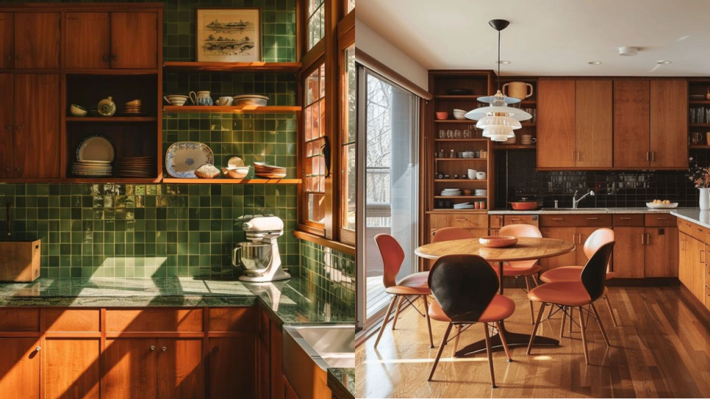
Kitchen and Dining Spaces
Apart from a place to eat, our kitchens and dining areas also serve as a place to connect with our families. Whether it be gossiping with your mother, rushing to make breakfast on a Monday morning, or having a cooking session with your kids as a fun activity on the weekends, our kitchens are a lively space in our households.
Appetizing, energizing, as well as inviting warm colors like soft yellows or light oranges can be your go-to options when choosing the right colors for this bustling family space.
Pairing with whites or lighter neutrals is a good way to add freshness and feelings of cleanliness to the space.
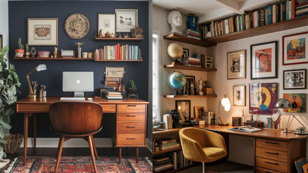
Office or Study Rooms
This is a place where you would want to have an atmosphere that stimulates focus, concentration, and a sense of balance. Blues and greens are found to be excellent promoters of concentration and calmness, making them perfect for your office or study spaces.
If you are someone with a creative side, you might want to throw in splashes of yellow here and there in the space to boost creativity.
Bathrooms
Bathrooms are generally spaces where we go to refresh ourselves. Often a place for deep thoughts and hour-long doom scrolling sessions, you would want these usually compact spaces to feel airy and open.
Crisp whites and soft blues are best for creating the refreshing vibe we want from our bathrooms. Adding natural colors and textures, like wood accents and sand-colored tiles, is a good way to enhance the vibe.
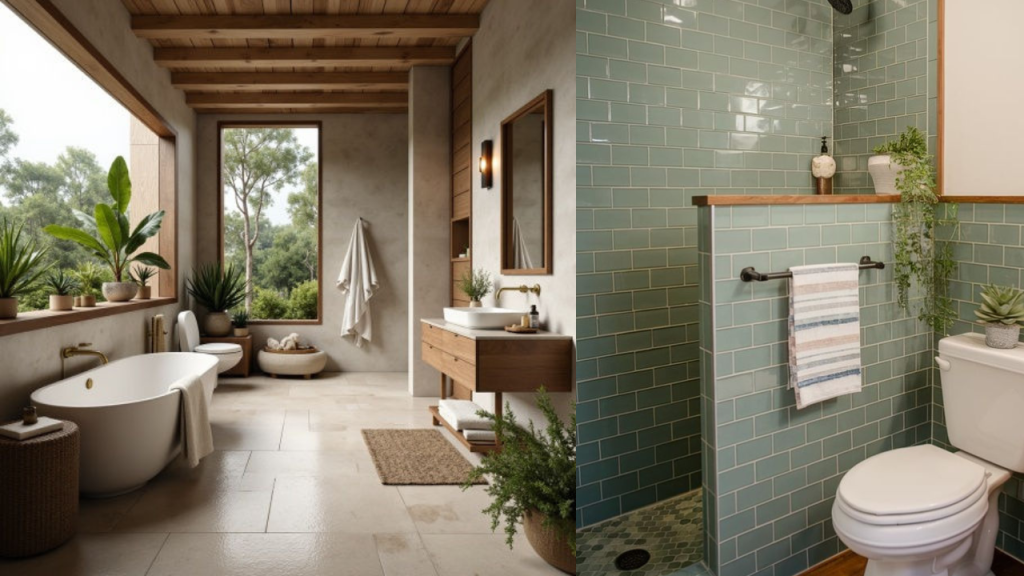
Feel free to throw in a plant or two to the space if that’s your thing.
6. Color Choice Best Practices
You should have gotten the hang of how to choose the right colors for your home by now. The best practice is to choose colors that align with the purpose of the space you are designing. Take a look at the list of best practices for choosing the right color scheme for designing your home.
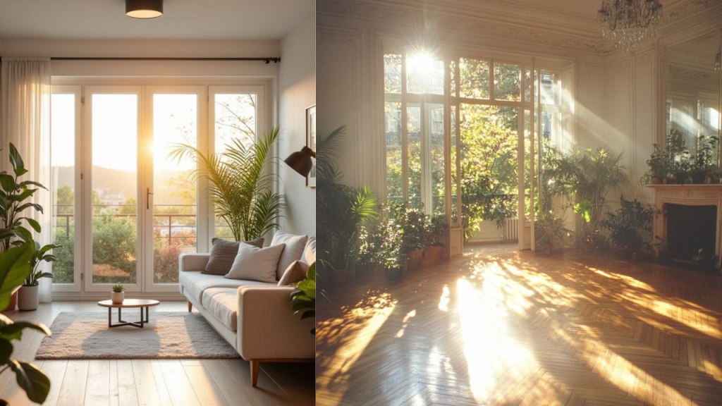
Consider Natural Lighting
Depending on the different times of the day and the direction of natural light, lighting can vary greatly. For instance, South-facing rooms usually receive a warm golden light, while North-facing rooms get a cooler light.
You can use opposing color tones, like cool colors for South-facing rooms, and warm colors for North-facing rooms, to balance the overall look of your room. Choosing the wrong colors for your room can be a major headache.
To ensure you do not face the same situation, you can observe large swatches of paint at different times of the day and see what works best for your needs.
Balance with Furniture and Decor
Walls of a room are usually the backdrop. The main elements of a room are the furniture, decorative items, and other functional items.
To ensure everything blends properly, you would probably want to avoid painting your walls unless all your flooring and large furniture are in place. This way, you will be able to clearly see everything come together.
Next up, you have two options. You can either choose the wall colors based on the elements of the room, or choose the elements based on the colors. In either scenario, it is best practice to balance out one with the other.
Consider Your Personal Preferences
Color psychology is a great way to design your space, but it is not absolute. While it provides general “rules”, you might have a completely different or even opposite reaction to certain colors.
For instance, blue might make you feel energetic and active, even though it is a cool color, which should have a calming effect.
Hence, you should always give more preference to your own relationship with each color when choosing wall paint for your home. After all, your home is an extension of your personality.
7. Conclusion
The key to choosing the best colors for your home is to use colors intentionally. Instead of following trends blindly, ask yourself what you would want your space to resonate with.
You can start by asking yourself questions like, “Do I want my living room to feel warm and cozy?”, “Does a cool and airy atmosphere suit my living room best?”, “Am I engaged in a lot of creative work and want my study area to inspire creativity?”. Answering these questions gives you an overview of your own preferences and helps you transform your home into an extension of yourself.
Remember, the whole point of design is to transform your house into your home. Visual aesthetics alone are not sufficient reason to incorporate a design into your home.